The 'V' Logo: How Minimalist Branding Dominated the Hypebeast Era
The ‘V’ Logo: How Minimalist Branding Dominated the Hypebeast Era
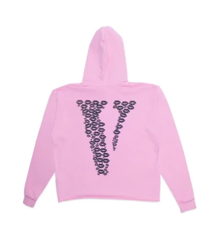
In the age of loud graphics, complex patterns, and logo-heavy fashion, one simple symbol managed to rise above the noise—the VLONE “V.” Oversized, bold, and unapologetically minimal, the “V” logo became one of the most recognizable icons of the hypebeast era. Its power did not come from intricate design or luxury detailing, but from clarity, placement, and meaning. The success of the “V” proves that sometimes, less truly is more.
The Rise of Minimalist Branding in Streetwear
Streetwear has always thrived on symbolism. From simple wordmarks to iconic emblems, the genre favors visuals that communicate identity instantly. As hype culture exploded in the 2010s, brands competed for attention in an oversaturated market. Instead of becoming more complex, the most successful labels simplified.
Minimalist branding worked because it was easy to recognize, easy to remember, and easy to reproduce across different platforms. Social media, especially Instagram, rewarded bold visuals that could be understood in a single glance. The VLONE “V” fit perfectly into this new digital reality.
The Power of the “V”
The VLONE “V” is deceptively simple. A single letter, often printed large across the back of a hoodie or t-shirt, it commands attention without explanation. The scale of the logo turned the wearer into a walking billboard, but one that felt intentional rather than commercial.
The choice of the letter “V” itself carries weight. It subtly stands for Vlone, but it also evokes ideas of victory, individuality, and dominance. Whether intentional or not, these associations strengthened the logo’s impact. You didn’t need to know the brand’s history to feel the presence of the symbol.
Back Prints and Statement Placement
One of the smartest branding decisions VLONE made was placing the “V” on the back rather than the front. This flipped traditional logo placement and made the brand instantly distinctive. The back print turned away from the viewer, reinforcing VLONE’s philosophy of independence and nonconformity.
From a visual standpoint, back prints also photograph well. In street-style shots, concert photos, and social media posts, the “V” remained visible and dominant. This consistency helped the logo spread organically across platforms.
Scarcity Amplified the Symbol
The hypebeast era was driven by scarcity, and VLONE understood this perfectly. Limited drops meant fewer pieces in circulation, increasing demand and symbolic value. Owning a hoodie with the “V” wasn’t just about style—it was about access.
Because the logo was so simple, it became instantly associated with exclusivity. Seeing the “V” signaled that the wearer was tapped into street culture, drops, and moments. The logo became a badge of belonging.
Music, Culture, and Visual Repetition
The “V” logo gained momentum through constant visibility in music culture. Artists wearing VLONE on stage, in videos, and behind the scenes turned the logo into a cultural marker. Repetition reinforced recognition. The more people saw the “V,” the more powerful it became.
This cycle—music exposure, social media sharing, and limited availability—created a feedback loop that pushed the logo into hypebeast legend. The symbol didn’t need explanation; it carried meaning through association.
Why Minimalism Won the Hypebeast Era
During the height of hype culture, attention was currency. Minimalist logos like VLONE’s “V” dominated because they cut through clutter. They were legible at a distance, adaptable across garments, and strong enough to stand alone.
While some brands relied on complex storytelling through graphics, VLONE told its story with one letter. This simplicity allowed fans to project their own meaning onto the logo, making it personal rather than prescriptive.
Influence on Modern Streetwear
The success of the “V” influenced a wave of minimalist branding across streetwear. Oversized letters, single symbols, and stripped-down designs became more common. Brands learned that identity could be communicated without overdesigning.
Even today, the impact of the “V” can be seen in how new labels approach logo placement and scale. The lesson remains clear: a strong symbol, used consistently, can outlast trends.
Criticism and Saturation
As with any successful symbol, overexposure eventually led to criticism. Some argued that the logo became repetitive or relied too heavily on hype. Yet this criticism itself highlights the logo’s dominance. Few symbols become iconic enough to face saturation.
Despite changing trends, the “V” remains instantly recognizable—a testament to its design strength.